Transmission are the world’s largest independent global B2B marketing agency. They developed an online data analytics tool to give insight into how respondents’ opinions and priorities differ across firmographic segments, and were to produce a report outlining their findings.
I helped them by developing a look & feel for their report, using images created by their 3D artist. The images illustrate the way in which the online tool works by connecting the data.
After finalising the look & feel and template pages, I designed the whole 66 page document.
Summer Campaign for the Royal Horticultural Society, targeting family days out, particularly families with children.
I worked with a copywriter to come up with 3 concepts for their summer mailer. I had to be a self-mailer and each concept had to incorporate a tear-off voucher.
The DL roll-fold was the design chosen to move forward with.
EY Fabric provide insights and services to build a better working world. They were to produce five films explaining how to use their new cloud based technology, EY Fabric Layers.
My job was to storyboard animations for each of the films: The Developer Layer, The Intelligence Layer, The Data Layer, The Cloud Layer and The Business Enablement Layer. The animations would accompany a voice over walking the user through the capabilities of each Layer.
The animations had to be created in the style of the EY Fabric iconography.
As the world entered a lockdown in 2020, Microsoft wanted to produce a suite of e-books to guide users through the remote working process. Each book was to focus on a different aspect of remote working: Embracing the new world of work, data analytics and cyber security.
I created a look and feel and carried it across the 3 books to produce 3 interactive PDFs.
Part of a social media campaign for Shell. Powering Progress was a recruitment initiative with the aim of spreading awareness to potential new employees of Shell’s transition to net-zero emissions.
I was asked to create double exposure imagery using portraits set against a forest, a city and a 3rd world industry.
Cats Protection wanted to produce four facebook static ads to encourage donations in memory of loved cats and cat owners. Two ads were to focus on cats in memory and two to focus on cat-people in memory. Each route needed an idea around looking for a way to remember loved ones, and looking for a way to celebrate the memory of loved ones. The different executions were for testing purposes.
I worked with the copywriter to create the ads using the cats-in-memory motif alongside emotive typography and imagery.
Taylor Wimpey wanted to develop some icons to represent each of their 6 categories under Major Developments (Housing developments of over 1000 houses).
Rather than create one icon to represent each category, I developed a series of icons for each and produced a visual identity by building an environment from the icons.
Agency: Big Kid
Leaflets explaining the 3 career programmes available at Taylor Wimpey: Graduate Programme, Apprenticeship Programme or Management Trainee. To be picked up by 14-18 year olds at various Careers fairs around the UK.
I was responsible for creating a look and feel for Career Journeys. I also created a brand identity for Career Journeys by Taylor Wimpey to be used across the 3 different career programmes.
The hand drawn elements add a playfulness to appeal to the target audience.
Agency: Big Kid
A brand awareness campaign for ABTA to increase awareness among 18 - 24 year old holiday bookers, whilst still talking to families and +55s.
I created a set of characters to represent all of the target audiences and designed a set of scenarios for each character. I designed print ads, web banners and social posts for each of the characters, as well as storyboarding animations for 2 of the target audiences.
I worked alongside the Creative Director.
Agency: Big Kid
Japan Tobacco International, Ireland, were holding a Japanese themed end of year party. It was a Bonenkai party: a party amongst colleagues/friends at the end of the year. ‘Bou’ means to forget, ‘nen’ means year, and ‘kai’ means gathering. As the name implies, the purpose of this party is to forget all of the troubles of the past year and look to the future with optimism.
The Japanese text on the front and reverse were a series of words which relate to looking ahead such as 'future', 'discovery' and 'honesty'.
Agency: Ignis.
Logo and visual identity for Tillemetry, Till software, reporting site and dashboard are the three components of Tillemetry's integrated data collection system.
I was responsible for logo design and visual identity.
Agency: Ignis
Spark is a web based digital newsletter produced for Ignis to promote their ethos "Sparking brand love". Edition 4 explores how to use events to leverage your brand without being the main sponsor.
I designed and art directed the Spark newsletter.
Agency: Ignis
Mobile app interface for Urban Visions. An augmented reality app which uses a scanner to bring to life limited edition packs of B&H. Five artists created animations which are projected from the special packs when they are scanned. The app also enables the user to download a wallpaper from each of the five packs.
I designed the pages for the app.
Agency: Ignis
Key visual and guidelines document for Sobranie Refine.
I worked alongside a 3D artist to create and retouch the the key visual. I also designed the template, cover and divider pages for the guidelines document.
Agency: Ignis
Toolkit for Benson & Hedges Additive Free. Cigarettes for smokers who prefer their ingredients to be natural and not tampered with.
I was responsible for the design and layout of the toolkit.
Agency: Ignis
A quarterly coffee table magazine mailed out to First Direct customers.
I worked on this project alongside an editor/writer. He provided the content and I provided the design, art direction and layout.
This was the pilot edition which we created for the pitch. We went on to win the business.
Agency: TMW
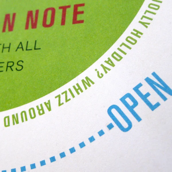
The car with all the answers. This piece of Direct Mail for The new Nissan Note was designed to look like a puzzle book.
I worked alongside an art director and copywriter who were responsible for the concept, I was responsible for the design, layout and design direction.
Agency: TMW
Typographic illustrations used as section dividers for First Direct corporate guidelines.
I worked alongside a copywriter and together we came up with playful typographic solutions for each of the sections within the toolkit.
I was responsible for the design and design direction.
Agency: TMW